User Input Area
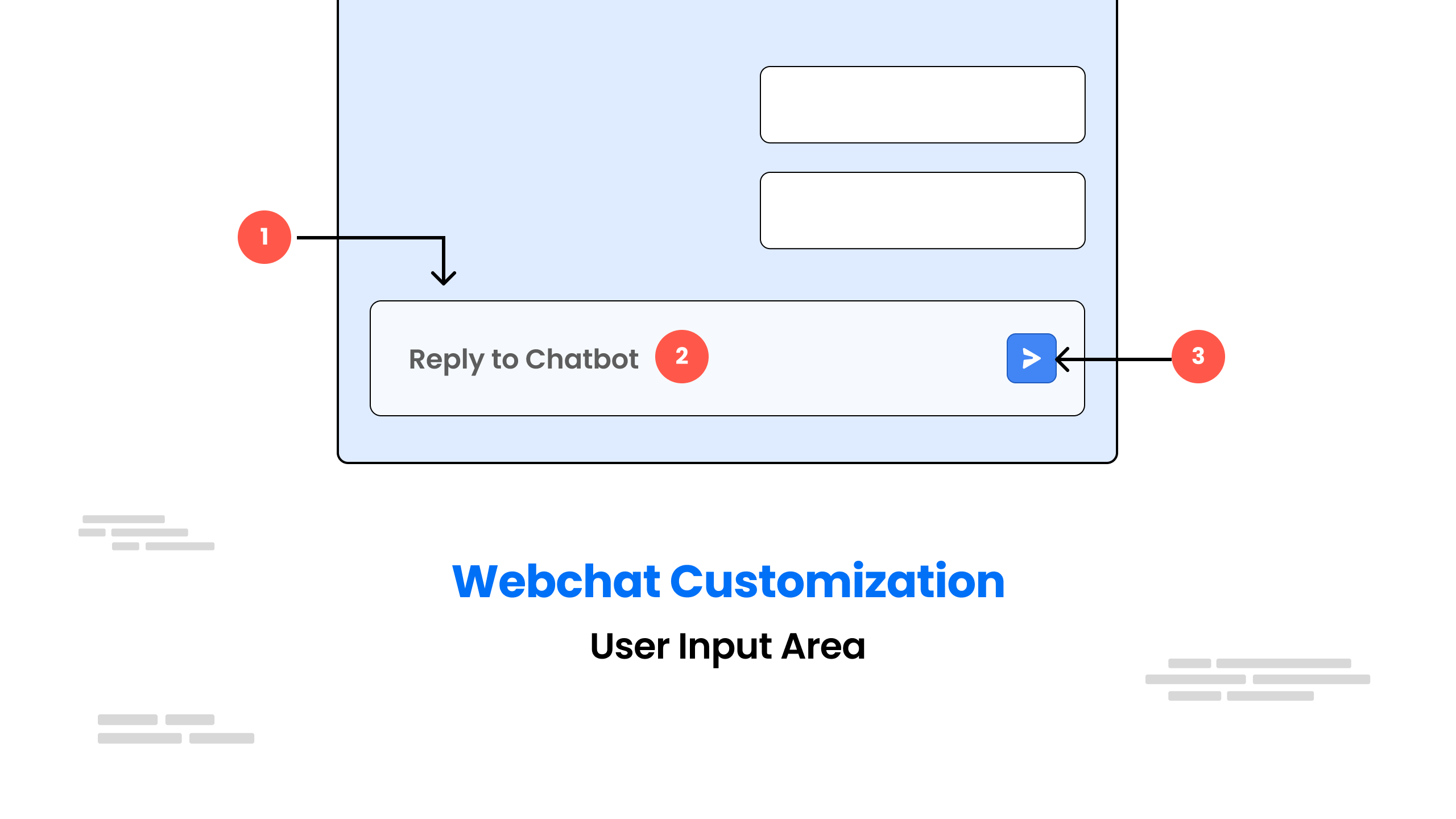
You can Customize the User Input(text-area and send button) using below CSS
input.css
/* Style for the composer section */
.bpw-composer {
  padding: 0; /* Remove any padding */
  position: relative; /* Set the position to relative */
  outline: none; /* Remove any outline */
  border: none; /* Remove any border */
}

/* Style for the composer inner section */
.bpw-composer-inner {
  padding: 0; /* Remove any padding */
  line-height: 0; /* Remove any line-height */
  position: relative; /* Set the position to relative */

  /* Set the display property for different browsers */
  display: -webkit-box;
  display: -ms-flexbox;
  display: flex;

  justify-content: space-between; /* Align items to the start and end of the container */
}

/* Style for the composer textarea */
.bpw-composer-textarea {
  flex-grow: 2; /* Allow the textarea to grow to fill the available space */
}

/* Styles for the textarea element in the composer */
.bpw-composer textarea {
  /* Sets the background color to a variable named "--white" */
  background: var(--white);
  /* Sets the border to a 1-pixel solid line using a variable named "--zinc-200" */
  border: 1px solid var(--zinc-200);
  /* Sets the border radius to a variable named "--spacing-medium" to make the edges rounded */
  border-radius: var(--spacing-medium);
  /* Sets the text color to a variable named "--zinc-900" */
  color: var(--zinc-900);
  /* Inherits the font family from the parent element */
  font-family: inherit;
  /* Sets the font size to 12 pixels */
  font-size: 12px;
  /* Sets the height of the textarea to 54 pixels */
  height: 54px;
  /* Sets the padding on the top to 19 pixels, and on the right and left to a variable named "--spacing-large" */
  padding: 19px var(--spacing-large) var(--spacing-large);
  /* Disables the ability to resize the textarea */
  resize: none;
  /* Adds a 0.2-second transition effect to the border when the focus changes */
  transition: border 0.2s;
  /* Sets the width of the textarea to 100% */
  width: 100%;
  /* Sets the margin on the right side to a variable named "--spacing-small" */
  margin-right: var(--spacing-small);
}

/* Styles for the textarea element when it is in focus */
.bpw-composer textarea:focus {
  /* Changes the border color to a variable named "--zinc-300" */
  border-color: var(--zinc-300);
}

/* Styles for the textarea element when it is in right-to-left mode */
.bpw-composer.rtl .bpw-composer-inner textarea {
  /* Sets the text direction to right-to-left */
  direction: rtl;
}

/* Styles for the textarea element when it is in left-to-right mode */
.bpw-composer.ltr .bpw-composer-inner textarea {
  /* Sets the text direction to left-to-right */
  direction: ltr;
}

/* Styles for the quick reply dropdown menu */
.bpw-keyboard-quick_reply-dropdown {
  /* Sets a margin of 0.2rem on the top and bottom and 0.5rem on the right and left */
  margin: 0.2rem 0.5rem;
}

/* Styles for the send button when it is disabled */
.bpw-send-button:disabled,
.bpw-send-button:disabled:hover {
  /* Sets the opacity to 0.4 to make the button appear slightly transparent */
  opacity: 0.4;
  /* Sets the background color to a variable named "--theme-primary" */
  background-color: var(--theme-primary);
  /* Changes the cursor to the default cursor */
  cursor: default;
}

/* Styles for the container holding the send buttons */
.bpw-send-buttons {
  /* Sets the display mode to flex and the direction to horizontal */
  display: flex;
  flex-direction: row;
  /* Aligns the items to the center */
  align-items: center;
}
/* This is the CSS style for the button that sends a message */

.bpw-send-button {
  display: flex; /* Set the button to be arranged using flexible layout */
  justify-content: center; /* Center the button's content horizontally */
  align-items: center; /* Center the button's content vertically */
  border-radius: var(
    --spacing-medium
  ); /* Make the corners of the button slightly rounded */
  background-color: var(
    --theme-primary
  ); /* Give the button a primary color background */
  padding: 20px; /* Add some extra space around the button's content */
  width: 24px; /* Set the button's width to be 24 pixels */
  height: 24px; /* Set the button's height to be 24 pixels */
  color: transparent; /* Hide any text that might appear inside the button */
  cursor: pointer; /* Show the pointer cursor when the button is hovered over */
  background-image: url(./button.png) !important; /* Add an image to the button */
  background-repeat: no-repeat !important; /* Don't repeat the image */
  background-position: center !important; /* Center the image inside the button */
  transition: background-color 0.2s; /* Make the button's background color change smoothly over a short period of time */
}

/* This is the CSS style for the button that sends a message when it's not disabled and is being hovered over */

.bpw-send-button:not(:disabled):hover {
  background-color: var(
    --theme-primary-hover
  ); /* Change the button's background color to a different color when it's being hovered over */
}

/* This is the CSS style for the voice recorder */

.bpw-voice-recorder {
  display: flex; /* Set the voice recorder to be arranged using flexible layout */
  flex-direction: row; /* Arrange the voice recorder's content horizontally */
  align-items: center; /* Center the voice recorder's content vertically */
}